Configurations and APIs
The Configuration Editor will use the configuration module to create the user interface for administrator, page/content administrator and translator. Build-in configuration settings allow to easily create an appealing UI for the user.
Create a Configuration Module and Register it in the Cards Manifest
Advanced design-time configuration and implementation should happen outside the manifest of the card.
With that, design-time code will not harm or influence the runtime or the card instance for the end-user.
Create a folder "dt" besides the manifest.json to store all configuration related artifacts.
Create a designtime.js file in this new folder.
Add the following initial module setup into the js file.
sap.ui.define(["sap/ui/integration/Designtime"], function (
	Designtime
) {
	"use strict";
	return function () {
		return new Designtime({
			"form": {
				"items": {
					// here goes the configuration
				}
			},
			"preview": {
				"modes": "Abstract"
			}
		});
	};
});
Similar to a Card Extension, the configuration module is registered in the manifest. As soon as the Configuration Editor is launched.
"sap.card": {
"configuration": {
"editor": "dt/configuration"
}
}
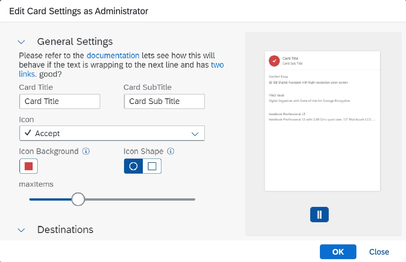
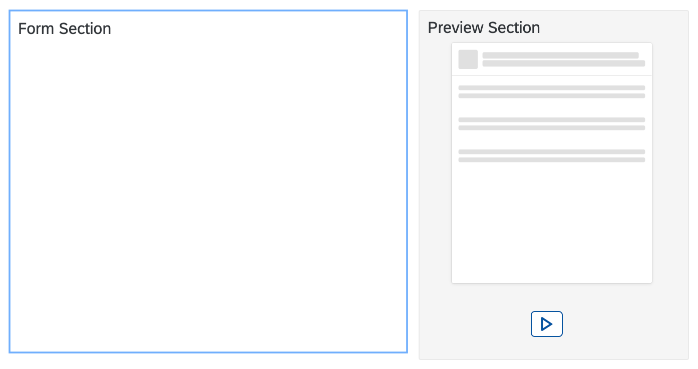
Configure the Editor's Form
Within the configuration the form section will contain the items that are shown in the editor
sap.ui.define(["sap/ui/integration/Designtime"], function (
	Designtime
) {
	"use strict";
	return function () {
		return new Designtime({
			"form": {
				"items": {
					...
				}
			},
			"preview": {
				"modes": "Abstract"
			}
		});
	};
});
|
|
Form Items
The items section is a map of item configuration.
Try it Out
| Property | Type | Required | Default | Description | Since |
|---|---|---|---|---|---|
| manifestpath | string | Yes | Path to the manifest value that should be edited.
In case a the type of the item is "group" the path can be omited.
manifestpath : "sap.card/configuration/parameters/title/value" |
1.83 | |
| type | string | Yes | "string" | Type of the value in the manifest that is edited. Currently "string", "string[]", "integer", "number",
"date", "datetime", "boolean", "object", "object[]", "group", "separator" are supported. type="group" in an item will allow to set an expandable panel within the form. It will contains all the parameters behind it and before the next item which type is "group" too. For a group typed item the manifestpath setting can be omitted. A label should be provided. type="separator" in an item will allow to set a separator (empty row) within the form. type : "string" |
1.83 |
| label | string | No | Name of the item in the form/items collection | Defines the label string. This value can be bound to values in the i18n file used in the
connected card.
label : "fixedString" |
1.83 |
| required | boolean | No | false | Defines whether the value is required or not. The editor's label for the field will get a "*"
to indicate this state.
required : true |
1.83 |
| visible | boolean | No | true | Defines whether the value is visible in the editor or not. For technical parameters it might
be needed to hide them from the user.
In future version an administrator is able to change the visible property for the
page/content administrator. This will only apply for
parameters that are visible to the administrator.
visible : true |
1.83 |
| editable | boolean | No | true | Defines whether the value is editable in the editor or not. For technical parameters it might
be needed to make them consistent from the user.
In future version an administrator is able to change the editable property for the
page/content administrator. This will only apply for
parameters that are editable by the administrator.
editable : true |
1.83 |
| translatable | boolean | No | false | Defines whether the value is potentially translatable and should be shown in the Configuration Editor
in translation mode.
This setting should be used for fields of type string only to indicate this state.
translatable : true |
1.83 |
| description | string | No | Defines the description of current field.
description : "Description of current field" |
1.83 | |
| cols | 1 or 2 | No | 2 | By default, the form in the editor spans field to its two columns. Setting cols=1 in two
sibling items,
will allow to align two fields next to each other
cols : 1 |
1.83 |
| Visualization | object of type Visualization | No | none | Defines a visualization for the field. It will render the field using the new control defined in visualization.
visualization : {
	// visualization settings
}
|
1.83 |
| allowDynamicValues | boolean | No | false | Defines whether the value can be bound to a context value of the host environment.
The default value for an administrator and content admin is false. In translation mode this
property is ignored.
To activate the feature additionally the allowDynamicValues property
of the Configuration Editor control needs to be enabled.
allowDynamicValues : true |
1.84 |
| allowSettings | boolean | No | true | Defines whether the administrator is allowed to change the settings of the field.
For example the administrator can hide or disable fields for the content mode.
To activate the feature additionally the allowSettings property
of the Configuration Editor control needs to be enabled.
allowSettings : true |
1.84 |
| placeholder | string | No | none | Defines a placeholder string that appears within a default input for string parameters.
placeholder : "My Placeholder" |
1.84 |
| expanded | boolean | No | true | Defines whether the Group panel is expanded in the editor or not.
Only for Group type parameter.
expanded : true |
1.86 |
| hint | string | No | none | Defines a hint string that appears below a group or an item with the formatted text.
hint : "Hint Message" |
1.86 |
| validation | object of type Validation | No | none | Defines a validation rule for the value of the field.
validation : {
	// validation settings
}
|
1.86 |
| validations | object[] of type Validation | No | none | Defines a validation rules for the value of the field.
validations : {
	// validations settings
}
|
1.86 |
| formatter | object of type formatter | No | none | Defines a formater options for the value of the field.
formatter : {
	// formatter options
}
|
1.88 |
| visibleToUser | boolean | No | true | Defines whether the field can be seen by user(page admin) or not. It can be changed in settings of the field.
visibleToUser : true |
1.91 |
| editableToUser | boolean | No | true | Defines whether the field is editable by user(page admin) or not. It can be changed in settings of the field.
editableToUser : true |
1.91 |
| layout | object of type layout | No | none | Defines the layout of the current label and field. If has such propety, the label and field will be renderred in 1 line.
"layout": {
"position": "field-label", //default: "label-field"
"alignment": {
"field": "end", //will align the field or label to end if the value is "end", or will align them to start
"label": "end"
},
"label-width": "80%" //default: "50%"
}
|
1.94 |
| maxLength | integer | No | 0 | Maximum number of characters. Value '0' means the feature is switched off.
This setting should be used for fields of type string only.
maxLength : 6 |
1.114 |
Providing Lists for String
To allow a selection of values for fields of type "string", you can add a values section. Similar to the card data section, the list can be filled with a static JSON or a request. The item section in the values definition links the data. The "key" property of the item is used as the value for the setting referred by the "manifestPath".
Static Data List
"stringWithStaticList": {
	"manifestpath": "/sap.card/configuration/parameters/stringWithStaticList/value",
	"type": "string",
	"values": {
		"data": {
			"json": {
				"values": [
					{ "text": "From JSON 1", "key": "key1" },
					{ "text": "From JSON 2", "key": "key2" },
					{ "text": "From JSON 3", "key": "key3" }
				]
			},
			"path": "/values"
		},
		"item": {
			"text": "{text}",
			"key": "{key}"
		}
	}
}
Request Data List
The referred URL will deliver the data asynchronously. Also an extension could be used as a data propvider.
"stringWithRequestList": {
	"manifestpath": "/sap.card/configuration/parameters/stringWithRequestList/value",
	"type": "string",
	"values": {
		"data": {
			"request": {
				"url": "./dt/listdata.json"
			},
			"path": "/values"
		},
		"item": {
			"text": "{text}",
			"key": "{key}"
		}
	}
}
{
	"values": [
		{ "text": "From JSON 1", "key": "key1" },
		{ "text": "From JSON 2", "key": "key2" },
		{ "text": "From JSON 3", "key": "key3" }
	]
}
Providing Lists for String Array
To allow a selection of values for fields of type "string[]", you can add the same values sections as above. Similar to the card data section, the list can be filled with a static JSON or a request. The item section in the values definition links the data. The "key" property of the item is used as the value for the setting referred by the "manifestPath".
Static Data List
"stringArrayWithStaticList": {
	"manifestpath": "/sap.card/configuration/parameters/stringArrayWithStaticList/value",
	"type": "string[]",
	"values": {
		"data": {
			"json": {
				"values": [
					{ "text": "From JSON 1", "key": "key1" },
					{ "text": "From JSON 2", "key": "key2" },
					{ "text": "From JSON 3", "key": "key3" }
				]
			},
			"path": "/values"
		},
		"item": {
			"text": "{text}",
			"key": "{key}"
		}
	}
}
Request Data List
The referred URL will deliver the data asynchronously. Also an extension could be used as a data propvider.
"stringArrayWithRequestList": {
	"manifestpath": "/sap.card/configuration/parameters/stringArrayWithRequestList/value",
	"type": "string[]",
	"values": {
		"data": {
			"request": {
				"url": "./dt/listdata.json"
			},
			"path": "/values"
		},
		"item": {
			"text": "{text}",
			"key": "{key}"
		}
	}
}
{
	"values": [
		{ "text": "From JSON 1", "key": "key1" },
		{ "text": "From JSON 2", "key": "key2" },
		{ "text": "From JSON 3", "key": "key3" }
	]
}
Providing Lists for Object
To allow a selection of values for fields of type "object", you can add a values section. Similar to the card data section, the list can be filled with a static JSON or a request. The properties section defines the object properties. The column section of each property defines a column for it in the values table. If no such section, will use the default settings to define a column.
Static Data List
"objectWithStaticList": {
	"manifestpath": "/sap.card/configuration/parameters/objectWithStaticList/value",
	"type": "object",
	"values": {
		"data": {
			"json": {
				"values": [
					{ "text": "text01", "key": "key01", "url": "https://sap.com/06", "icon": "sap-icon://accept", "iconcolor": "#031E48", "int": 1 },
					{ "text": "text02", "key": "key02", "url": "http://sap.com/05", "icon": "sap-icon://cart", "iconcolor": "#64E4CE", "int": 2 },
					{ "text": "text03", "key": "key03", "url": "https://sap.com/04", "icon": "sap-icon://zoom-in", "iconcolor": "#E69A17", "int": 3 },
				]
			},
			"path": "/values"
		},
		"allowAdd": true
	},
	"properties": {
		"key": {
			"label": "Key"
		},
		"icon": {
			"label": "Icon",
			"defaultValue": "sap-icon://add",
			"column": {
				"settings": {
					"hAlign": "Center",
					"width": "4rem"
				},
				"cell": {
					"type": "Icon",
					"color": "{iconcolor}"
				}
			}
		},
		"text": {
			"label": "Text",
			"defaultValue": "text",
			"column": {
				"settings": {
					"hAlign": "Center",
					"width": "6rem",
					"filterProperty": "text",
					"defaultFilterOperator": "Contains"   // values are in enum sap.ui.model.FilterOperator
				}
			}
		},
		"url": {
			"label": "URL",
			"defaultValue": "http://",
			"column": {
				"settings": {
					"hAlign": "Center",
					"width": "10rem",
					"label": "URL Link",
					"filterProperty": "url",
					"defaultFilterOperator": "StartsWith"
				},
				"cell": {
					"type": "Link",
					"href": "{url}"
				}
			}
		},
		"editable": {
			"label": "Editable",
			"defaultValue": false,
			"type": "boolean",
			"column": {
				"cell": {
					"type": "CheckBox"
				}
			}
		},
		"int": {
			"label": "Integer",
			"defaultValue": 0,
			"type": "int",
			"formatter": {
				"minIntegerDigits": 1,
				"maxIntegerDigits": 6,
				"emptyString": ""
			},
			"column": {
				"settings": {
					"hAlign": "Center",
					"width": "5rem",
					"label": "Integer",
					"filterProperty": "int",
					"defaultFilterOperator": "EQ",
					"filterType": "sap.ui.model.type.Integer"   //sap.ui.model.type
				}
			}
		}
	}
}
Request Data List
The referred URL will deliver the data asynchronously. Also an extension could be used as a data propvider.
"objectWithRequestList": {
	"manifestpath": "/sap.card/configuration/parameters/objectWithRequestList/value",
	"type": "object",
	"values": {
		"data": {
			"request": {
				"url": "./dt/listdata.json"
			},
			"path": "/values"
		}
	},
	"properties": {
		"key": {
			"label": "Key"
		},
		"icon": {
			"label": "Icon",
			"defaultValue": "sap-icon://add",
			"column": {
				"settings": {
					"hAlign": "Center",
					"width": "4rem"
				},
				"cell": {
					"type": "Icon",
					"color": "{iconcolor}"
				}
			}
		},
		"text": {
			"label": "Text",
			"defaultValue": "text",
			"column": {
				"settings": {
					"hAlign": "Center",
					"width": "6rem",
					"filterProperty": "text",
					"defaultFilterOperator": "Contains"   // values are in enum sap.ui.model.FilterOperator
				}
			}
		},
		"url": {
			"label": "URL",
			"defaultValue": "http://",
			"column": {
				"settings": {
					"hAlign": "Center",
					"width": "10rem",
					"label": "URL Link",
					"filterProperty": "url",
					"defaultFilterOperator": "StartsWith"
				},
				"cell": {
					"type": "Link",
					"href": "{url}"
				}
			}
		}
	}
}
{
	"values": [
		{ "text": "text1req", "key": "key1", "additionalText": "addtext1", "icon": "sap-icon://accept" },
		{ "text": "text2req", "key": "key2", "additionalText": "addtext2", "icon": "sap-icon://cart" },
		{ "text": "text3req", "key": "key3", "additionalText": "addtext3", "icon": "sap-icon://zoom-in" },
		{ "text": "text4req", "key": "key4", "additionalText": "addtext4", "icon": "sap-icon://zoom-out" }
	]
}
Providing Lists for Object Array
To allow a selection of values for fields of type "object[]", you can add a values section. Similar to the card data section, the list can be filled with a static JSON or a request. The properties section defines the object properties. The column section of each property defines a column for it in the values table. If no such section, will use the default settings to define a column.
Static Data List
"objectArrayWithStaticList": {
	"manifestpath": "/sap.card/configuration/parameters/objectArrayWithStaticList/value",
	"type": "object[]",
	"values": {
		"data": {
			"json": {
				"values": [
					{ "text": "text01", "key": "key01", "url": "https://sap.com/06", "icon": "sap-icon://accept", "iconcolor": "#031E48", "int": 1 },
					{ "text": "text02", "key": "key02", "url": "http://sap.com/05", "icon": "sap-icon://cart", "iconcolor": "#64E4CE", "int": 2 },
					{ "text": "text03", "key": "key03", "url": "https://sap.com/04", "icon": "sap-icon://zoom-in", "iconcolor": "#E69A17", "int": 3 },
				]
			},
			"path": "/values"
		},
		"allowAdd": true
	},
	"properties": {
		"key": {
			"label": "Key"
		},
		"icon": {
			"label": "Icon",
			"defaultValue": "sap-icon://add",
			"column": {
				"settings": {
					"hAlign": "Center",
					"width": "4rem"
				},
				"cell": {
					"type": "Icon",
					"color": "{iconcolor}"
				}
			}
		},
		"text": {
			"label": "Text",
			"defaultValue": "text",
			"column": {
				"settings": {
					"hAlign": "Center",
					"width": "6rem",
					"filterProperty": "text",
					"defaultFilterOperator": "Contains"   // values are in enum sap.ui.model.FilterOperator
				}
			}
		},
		"url": {
			"label": "URL",
			"defaultValue": "http://",
			"column": {
				"settings": {
					"hAlign": "Center",
					"width": "10rem",
					"label": "URL Link",
					"filterProperty": "url",
					"defaultFilterOperator": "StartsWith"
				},
				"cell": {
					"type": "Link",
					"href": "{url}"
				}
			}
		},
		"editable": {
			"label": "Editable",
			"defaultValue": false,
			"type": "boolean",
			"column": {
				"cell": {
					"type": "CheckBox"
				}
			}
		},
		"int": {
			"label": "Integer",
			"defaultValue": 0,
			"type": "int",
			"formatter": {
				"minIntegerDigits": 1,
				"maxIntegerDigits": 6,
				"emptyString": ""
			},
			"column": {
				"settings": {
					"hAlign": "Center",
					"width": "5rem",
					"label": "Integer",
					"filterProperty": "int",
					"defaultFilterOperator": "EQ",
					"filterType": "sap.ui.model.type.Integer"   //sap.ui.model.type
				}
			}
		}
	}
}
Request Data List
The referred URL will deliver the data asynchronously. Also an extension could be used as a data propvider.
"objectArrayWithRequestList": {
	"manifestpath": "/sap.card/configuration/parameters/objectArrayWithRequestList/value",
	"type": "object[]",
	"values": {
		"data": {
			"request": {
				"url": "./dt/listdata.json"
			},
			"path": "/values"
		}
	},
	"properties": {
		"key": {
			"label": "Key"
		},
		"icon": {
			"label": "Icon",
			"defaultValue": "sap-icon://add",
			"column": {
				"settings": {
					"hAlign": "Center",
					"width": "4rem"
				},
				"cell": {
					"type": "Icon",
					"color": "{iconcolor}"
				}
			}
		},
		"text": {
			"label": "Text",
			"defaultValue": "text",
			"column": {
				"settings": {
					"hAlign": "Center",
					"width": "6rem",
					"filterProperty": "text",
					"defaultFilterOperator": "Contains"   // values are in enum sap.ui.model.FilterOperator
				}
			}
		},
		"url": {
			"label": "URL",
			"defaultValue": "http://",
			"column": {
				"settings": {
					"hAlign": "Center",
					"width": "10rem",
					"label": "URL Link",
					"filterProperty": "url",
					"defaultFilterOperator": "StartsWith"
				},
				"cell": {
					"type": "Link",
					"href": "{url}"
				}
			}
		}
	}
}
{
	"values": [
		{ "text": "text1req", "key": "key1", "additionalText": "addtext1", "icon": "sap-icon://accept" },
		{ "text": "text2req", "key": "key2", "additionalText": "addtext2", "icon": "sap-icon://cart" },
		{ "text": "text3req", "key": "key3", "additionalText": "addtext3", "icon": "sap-icon://zoom-in" },
		{ "text": "text4req", "key": "key4", "additionalText": "addtext4", "icon": "sap-icon://zoom-out" }
	]
}
Validation of Field Value
Validation of value can be added to the validation(s) settings in the configuration of each field. Please ensure that users are not overwhelmed with error and warning messages. Use validation wisely.
"string1": {
	"type": "string",
	"required": true,  // this is a validation rule, it will automatically check for empty value, no need to define a validation for it.
	"validation": {
		"type": "error",
		"maxLength": 20
	}
},
"int1": {
	"type": "integer",
	"required": true, // this is a validation rule, it will automatically check for empty value, no need to define a validation
	for it.
	"validation": {
		"type": "error",
		"maximum": 20,
		"minimum": 10,
		"exclusiveMinimum": true,
		"message": "Your message" // optional
	}
},
"string2": {
	"type": "string",
	"validations": [
		{
			"type": "error",
			"maxLength": 20,
			"message": "Your message" // optional
		},
		{
			"type": "error",
			"minLength": 1,
			"message": "Your message" // optional
		},
		{
			"type": "warning",
			"pattern": "^(\\([0-9]{3}\\))?[0-9]{3}-[0-9]{4}$", // American phone number
			"message": "Your message" // optional
		},
		{
			"type": "warning",
			"validate": function (value) {
				// do your own checks here
			},
			"message": "Your message" // optional
		}
	]
}
Now users can also validate the value via request result.
"boolean1": {
	"manifestpath": "/sap.card/configuration/parameters/boolean1/value",
	"type": "boolean",
	"visualization": {
		"type": "sap/m/Switch",
		"settings": {
			"busy": "{currentSettings>_loading}",
			"state": "{currentSettings>value}",
			"customTextOn": "Yes",
			"customTextOff": "No",
			"enabled": "{currentSettings>editable}"
		}
	},
	"validations": [{
		"type": "error",
		"validate": function (value, config, context) {
			return context["requestData"]({
				"data": {
					"extension": {
						"method": "checkCanSeeCourses"
					},
					"path": "/values/canSeeCourses"
				}
			}).then(function (oData){
				if (oData === false && value === true) {
					//to hide the whole parameter :
					config.visible = false;
					//just change the Switch :
					//context["control"].setState(false);
					return false;
				}
				return true;
			});
		},
		"message": "Do not have right to request data, disable it"
	}]
},
"boolean2": {
	"manifestpath": "/sap.card/configuration/parameters/boolean2/value",
	"type": "boolean",
	"validations": [{
		"type": "error",
		"validate": function (value, config, context) {
			return context["requestData"]({
				"data": {
					"extension": {
						"method": "checkCanSeeCourses"
					},
					"path": "/values/canSeeCourses"
				}
			}).then(function (oData){
				if (oData === false && value === true) {
					//to hide the whole parameter :
					//config.visible = false;
					//just change the checkbox :
					context["control"].setSelected(false);
					return false;
				}
				return true;
			});
		},
		"message": "Do not have right to request data, disable it"
	}]
},
"Customers1": {
	"manifestpath": "/sap.card/configuration/parameters/Customers1/value",
	"type": "string[]",
	"required": true,
	"values": {
		"data": {
			"request": {
				"url": "{{destinations.northwind}}/Customers",
				"parameters": {
					"$select": "CustomerID, CompanyName, Country, City, Address"
				}
			},
			"path": "/value"
		},
		"item": {
			"text": "{CompanyName}",
			"key": "{CustomerID}",
			"additionalText": "{= ${CustomerID} !== undefined ? ${Country} + ', ' +  ${City} + ', ' + ${Address} : ''}"
		}
	},
	"validations": [{
		"type": "error",
		"validate": function (value, config, context) {
			return context["requestData"]({
				"data": {
					"extension": {
						"method": "getMinLength"
					},
					"path": "/values/minLength"
				}
			}).then(function (oData){
				if (value.length < oData) {
					context["control"].setEditable(false);
					return false;
				}
				return true;
			});
		},
		"message": "Please select more items!"
	}]
},
"Customers2": {
	"manifestpath": "/sap.card/configuration/parameters/Customers2/value",
	"type": "string[]",
	"required": true,
	"values": {
		"data": {
			"request": {
				"url": "{{destinations.northwind}}/Customers",
				"parameters": {
					"$select": "CustomerID, CompanyName, Country, City, Address"
				}
			},
			"path": "/value"
		},
		"item": {
			"text": "{CompanyName}",
			"key": "{CustomerID}",
			"additionalText": "{= ${CustomerID} !== undefined ? ${Country} + ', ' +  ${City} + ', ' + ${Address} : ''}"
		}
	},
	"validations": [{
		"type": "error",
		"validate": function (value, config, context) {
			return context["requestData"]({
				"data": {
					"request": {
						"url": "{{destinations.northwind}}/getMaxLength"
					},
					"path": "/values/maxLength"
				}
			}).then(function (oData){
				if (value.length > oData) {
					context["control"].setEditable(false);
					return false;
				}
				return true;
			});
		},
		"message": "Please remove some items!"
	}]
}
| Property | Type | Required | Default | For Type | Description | Since |
|---|---|---|---|---|---|---|
| type | ["error","warning"] | No | error | all | Defines the type of the message (error or warning) that should appear on the field.
type: "error" |
1.86 |
| message | string | No | none | all | Defines the error message that should appear. If not given a default message will appear.
message: "{i18n>TRANSLATABLE_ERROR_MESSAGE}"
|
1.86 |
| minLength | integer | No | 0 | string/string[] | Minimal length of a string value. Minimal size of a string array value. minLength : 10 |
1.86 |
| maxLength | integer | No | unlimited | string/string[] | Maximal length of a string value Maximal size of a string array value. maxLength : 10 |
1.86 |
| pattern | Reg Exp string | No | none | string | String values are only valid if text matches the given Regular Expression.
pattern : "^(\\([0-9]{3}\\))?[0-9]{3}-[0-9]{4}$"
|
1.86 |
| validate | function | No | none | all | Own implementation function to check value.
validate : function(value, config, context) {
	return context["requestData"]({
		"data": {
			"request": {
				"url": "{{destinations.northwind}}/getMaxLength"
			},
			"path": "/values/maxLength"
		}
	}).then(function (oData){
		if (value.length > oData) {
			context["control"].setEditable(false);
			return false;
		}
		return true;
	});
}
or
validate: function (value, config, context) {
	return context["requestData"]({
		"data": {
			"request": {
				"url": "{{destinations.mock_request}}/checkValidation"
			},
			"path": "/values/valueRange"
		}
	}).then(function (valueRange){
		var oResult = true;
		if (!value || value.length === 0) {
			oResult = false;
		}
		for (var i = 0; i < value.length; i++) {
			var sKey = value[i];
			if (!includes(valueRange, sKey)) {
				oResult = false;
				break;
			}
		}
		return {
			"isValid": oResult,
			"data": valueRange
		};
	});
}
or
validate : function (value) {
	return value !== 5;
}
|
1.86 |
| minimum | integer | No | none | integer/number | Minimum value for the number
minimum : 10 |
1.86 |
| maximum | integer | No | none | integer/number | Maximum value for the number
maximum : 20 |
1.86 |
| exclusiveMinimum | boolean | No | false | integer/number | Whether the given minimum should be excluded.
minimum: 10, exclusiveMinimum : true // 10 is not allowed, but 10.00001 |
1.86 |
| exclusiveMaximum | boolean | No | false | integer/number | Whether the given maximum should be excluded.
maximum: 20, exclusiveMaximum : true // 20 is not allowed, but 19.9999 |
1.86 |